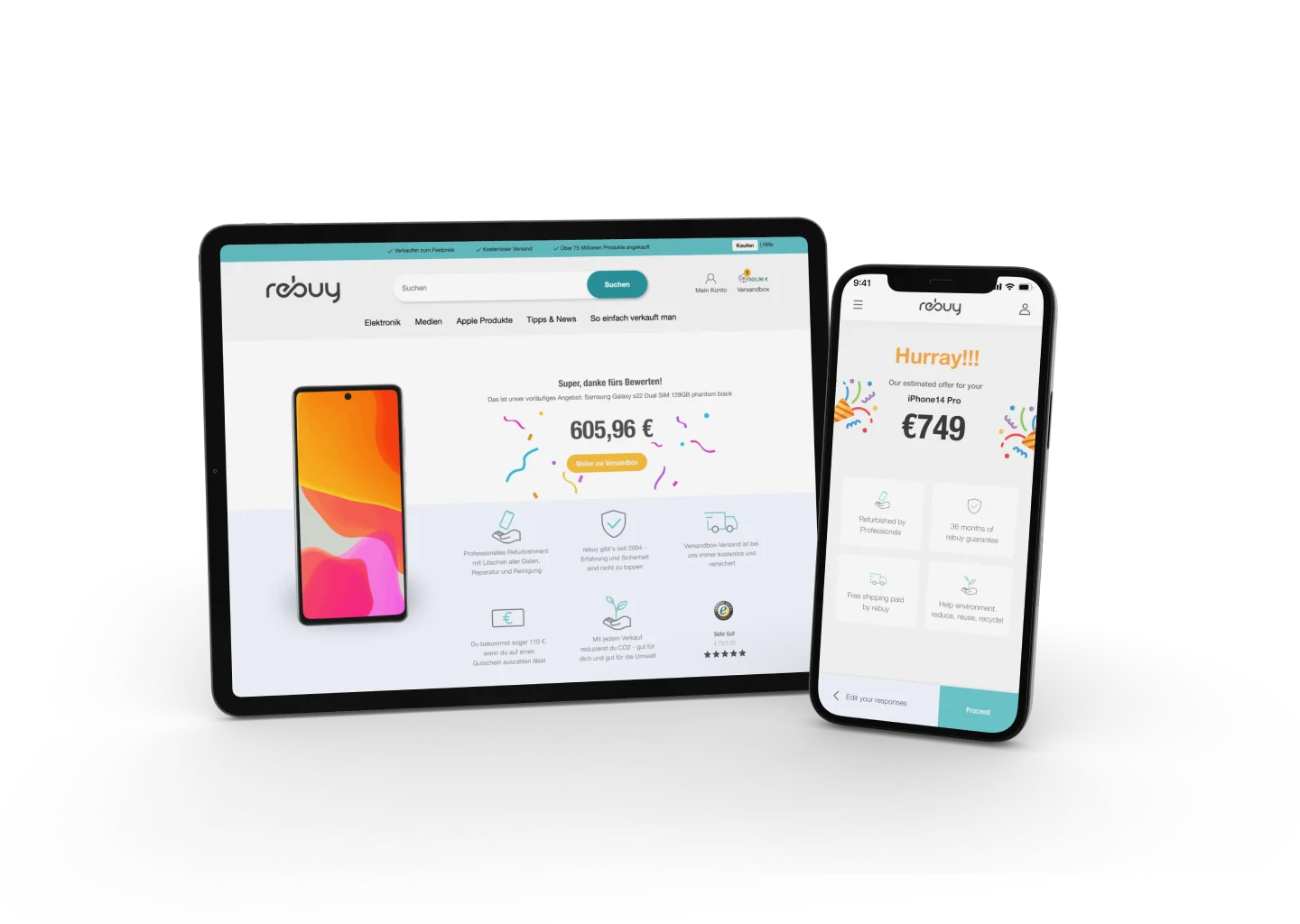
Rebuy
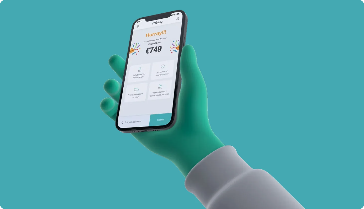
Increased checkout completion by 38% in Rebuy's device buying funnel
- My role
- Senior Product Designer
- Team
- 9 engineers, 3PM, 2 designers (for iOS & android)
- Timeline
- 4 months, launched before Black Friday 2022
- Methods
- User interviews, task-based usability tests, competitor analysis, wireframing, prototyping
The problem
On rebuy's "Verkaufen" (buy) side, customers can sell their old phones and electronics. But the process felt slow and uncertain:
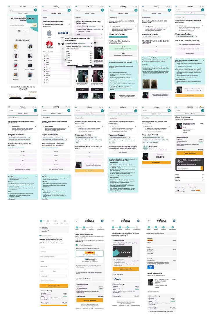
- Answer a long list of questions about the device's condition
- Wait for an email with a price
- Ship the device
- Wait again while rebuy inspects it, sometimes for days or even weeks
- Sometimes get a lower offer than expected, or a rejection
Many users never finished the assessment. The solution built earlier for iPhones helped a little, but it didn't scale to other electronics and needed constant manual maintenance.
The goal
Redesign the assessment funnel so it works for every device category, gets more people to the end, and launches before the Black Friday rush.
Research
8 user interviews with people who had sold devices on rebuy before. Ages 25-55, balanced gender, mix of first-timers and repeat sellers, different loyalty to the brand. Each session was a semi-structured interview plus a task-based usability test on the existing funnel, with satisfaction and ease-of-use ratings after each task.
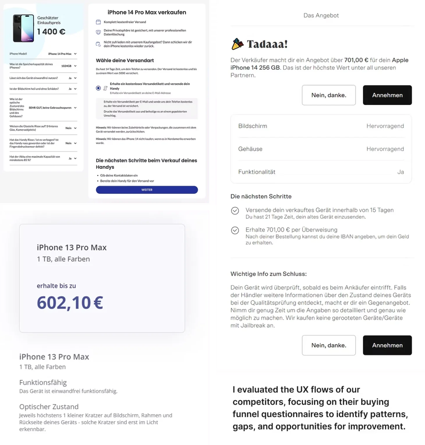
Competitor check: I looked at Swappie, Back Market and Refurbed, plus manufacturer trade-in programs from Apple and Samsung.
The takeaway: competitors win on instant, transparent quotes, while rebuy's flow made users feel they had no control over the outcome.
Insights
Uncertainty kills completion. Users didn't know what price they'd get until the very end, so many dropped out.
Too many steps, too little guidance. Condition questions felt long and unexplained.
Errors came too late. People only found out about mistakes after submitting, then had to backtrack.
Grading felt arbitrary. Users didn't understand why a scratch meant a lower price.
The redesign
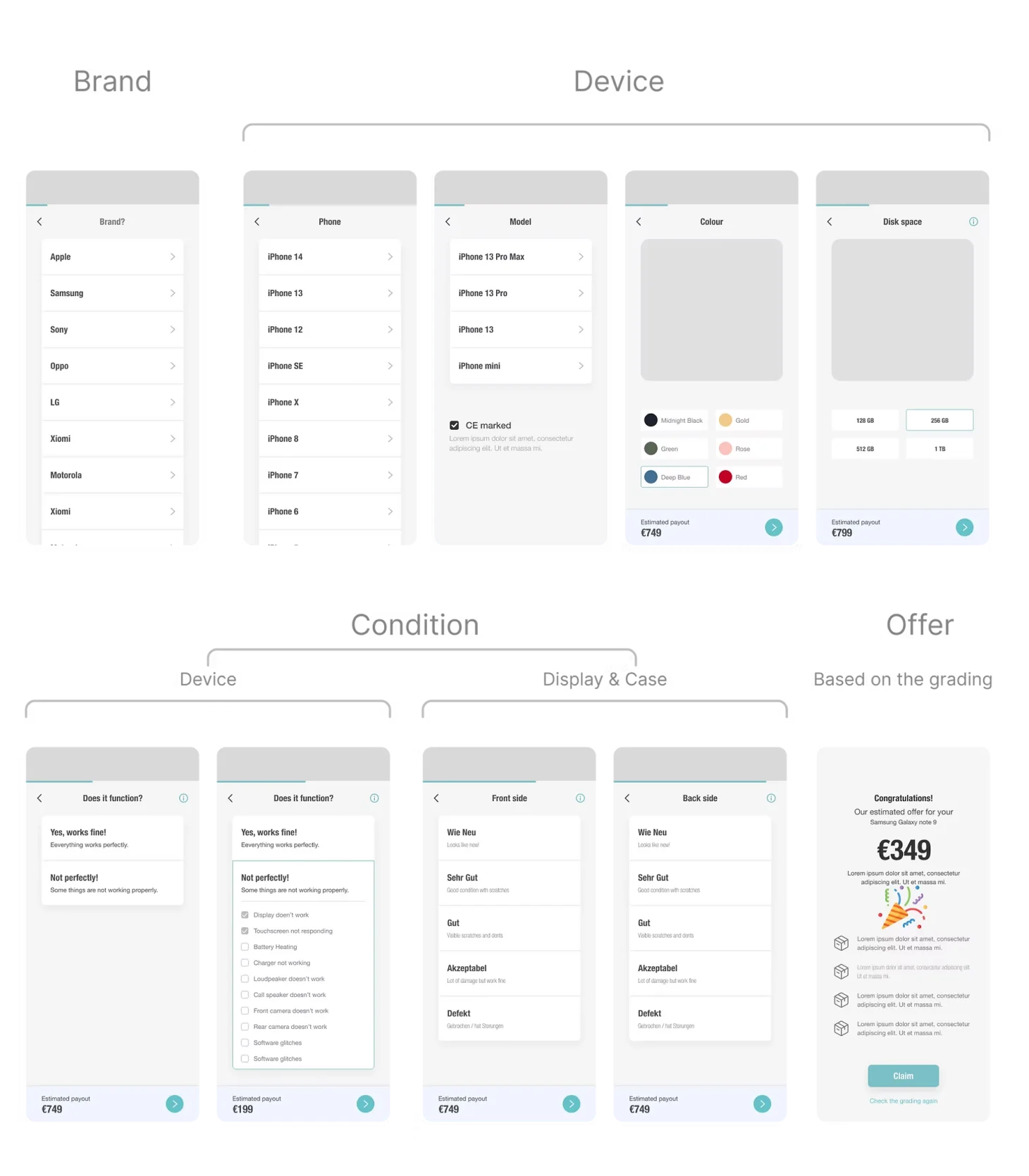
I started mobile first with sketches and wireframes, then refined them with stakeholders and user feedback. Three changes made the biggest difference:
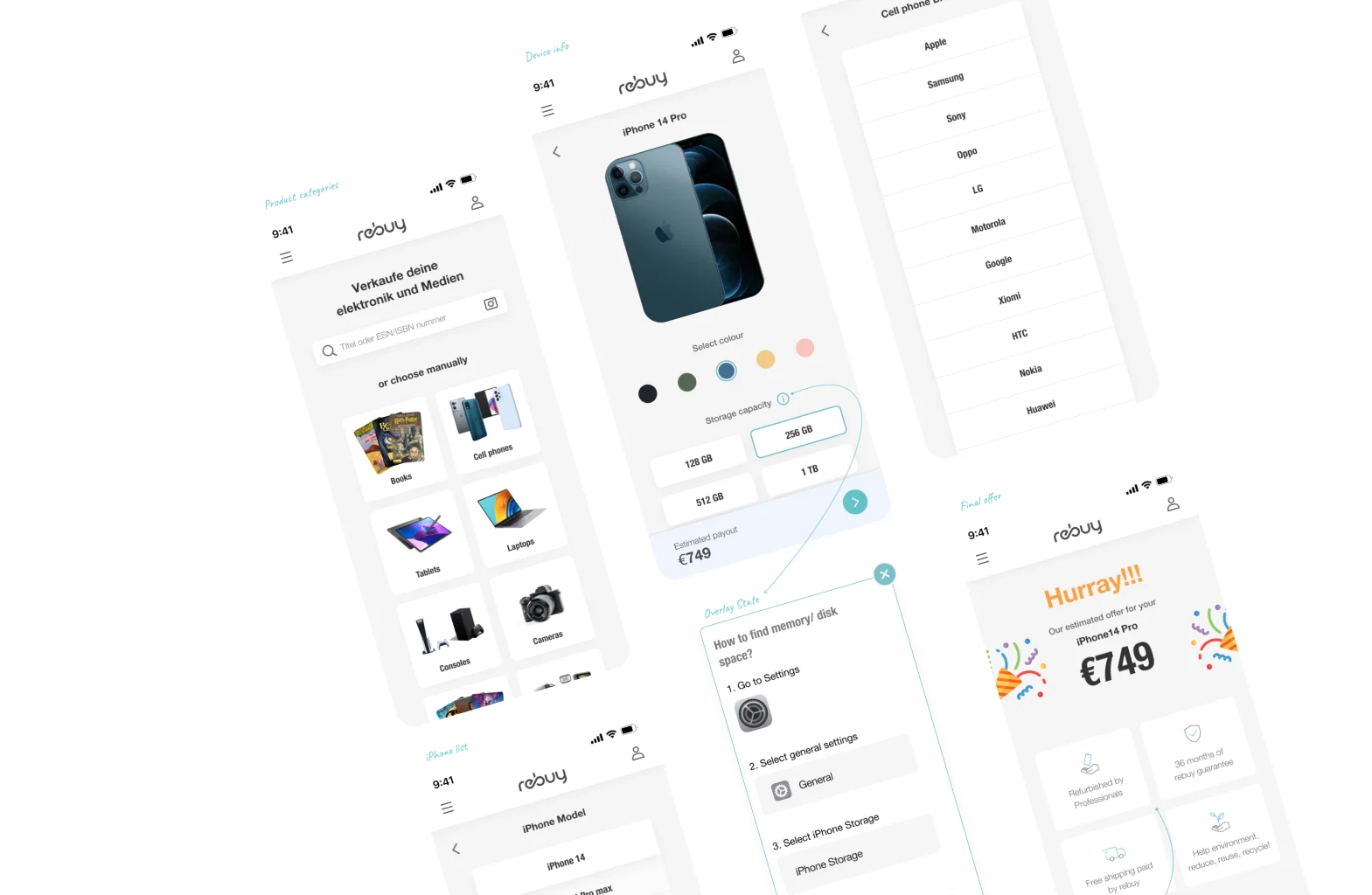
- Fewer steps. Device and condition details were merged into one flow with clear labels and grouped fields. Fewer clicks, more momentum.
- Better forms and error handling. Inline validation shows errors right next to the field, and users can change earlier answers anytime. No more starting over.
- A live price indicator. The offer appears as soon as the user picks their device, and updates with every condition they add, shown in a progress bar at the bottom. Users could see how each answer affected the price, which reduced anxiety and encouraged them to finish.
I also brought rebuy's brand values into the design system and decluttered the interface, with clean and minimal design.
Testing and launch
We received 90% favorable response of the new design in user testing (with 7-8 live users from userTesting.com, and couple of non-tech colleagues who are interested to participate)
We shipped with 50/50 random segment into A/B test 2 weeks ahead of Black Friday, so that we can full release before Black Friday.
What I learned
- Simplify before adding features. Cutting steps helped users focus on the goal
- Progress and price cues reduce anxiety. People finish what they can see the end of
- Immediate feedback beats late errors. Inline validation saves time and frustration
- Save upsells for after the main task. They work better once the job is done
What's next
rebuy decided to let users keep their payout in the platform and spend it on any product, closing the loop from selling to buying. That's a separate case study, happy to talk about it.