Heiland
Reactivated 60% of dormant accounts and cut reorder time from 18 to 4 minutes
- My role
- Product Owner & Designer
- Team
- 7 engineers, 3 from sales
- Tools
- Figma, Lovable, Jira, HubSpot, Google Analytics, MS Clarity
The problem
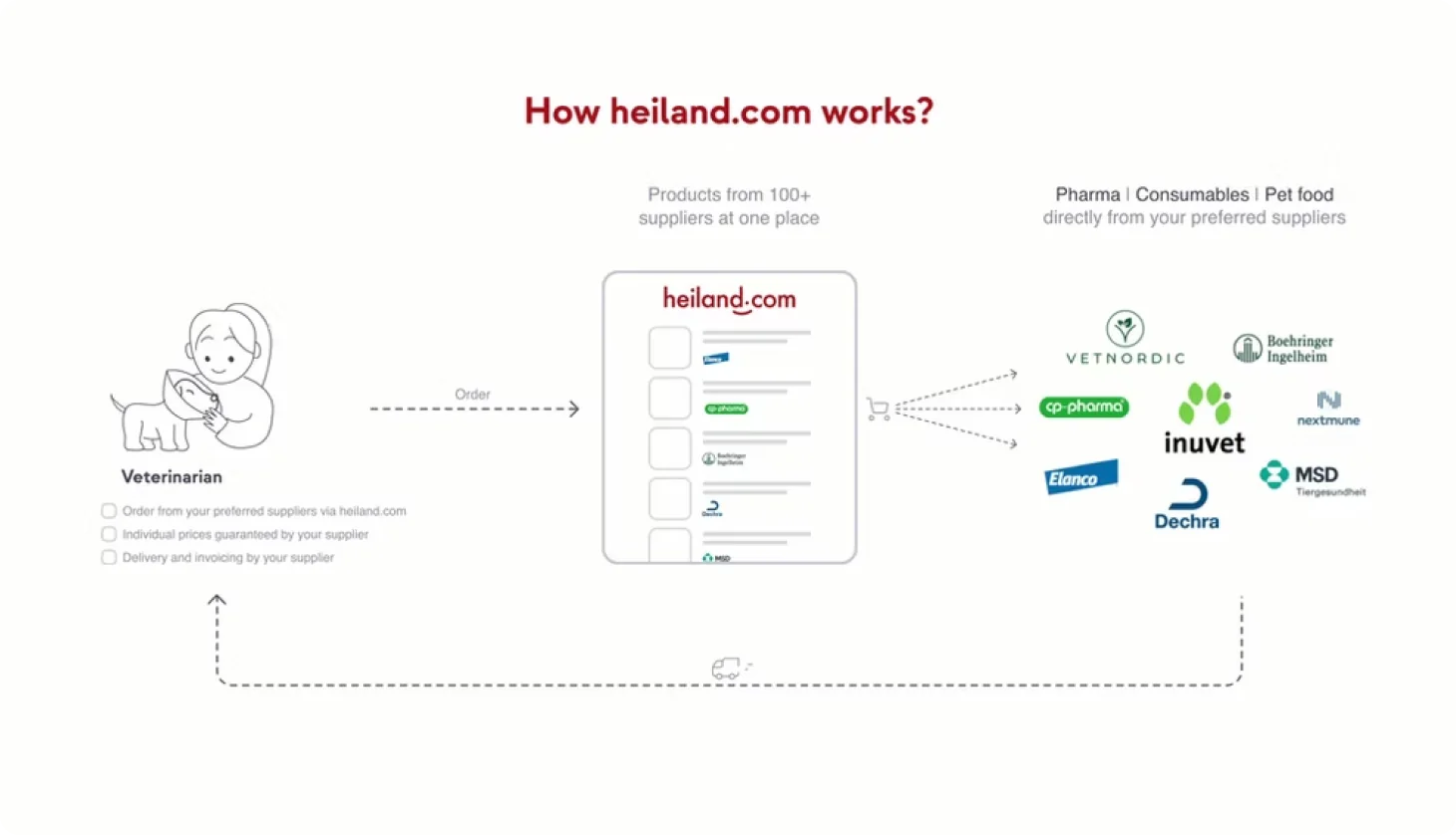
Heiland is like Amazon for vet clinics: one place to order medicine and equipment from hundreds of suppliers. Sign-ups were healthy, but majority of registered clinics hadn't ordered in over 90 days. They signed up, bought once, and went back to phone calls and paper catalogs.
For the business that meant high acquisition cost and low lifetime value. For vets, the platform wasn't becoming part of their daily routine.
The goal
Reactivate 3,000 dormant accounts, boost repeat purchases, and make heiland the default way clinics order.
Discovery
Digging into HubSpot and Google Analytics showed 3000 users out of 5000 did not ordered in last 90 days. I talked face to face with 3 purchase managers and 1 solo vet. Due to their work condition it's difficult to sit for an interview, so I also visited couple of clinics just to observe without questioning.
Also I went through months of "feature requests" from the sales team: out-of-stock info, changing prices and freight costs, real-time price updates, etc.
Insights
Blank slate fatigue: Every login meant searching for the same supplies from scratch. No quick reorder.
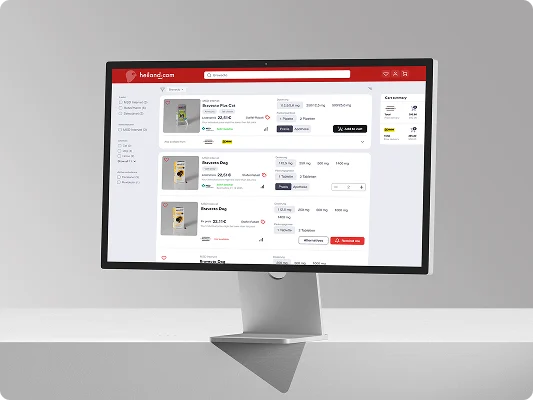
Messy search results: Every product have multiple supplier with different product variants available, minimum order value and delivery fee.
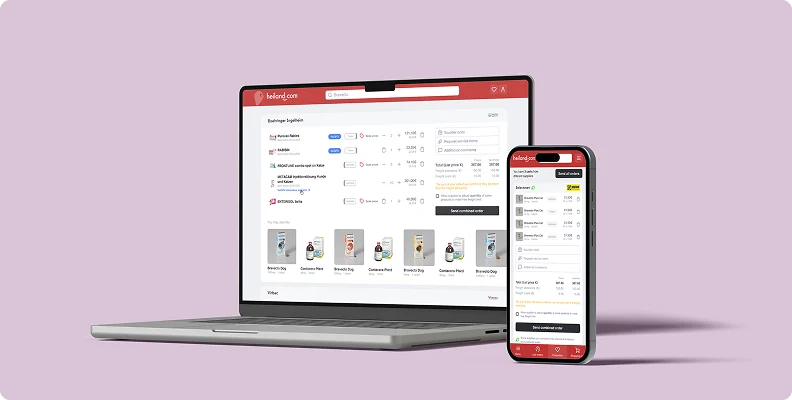
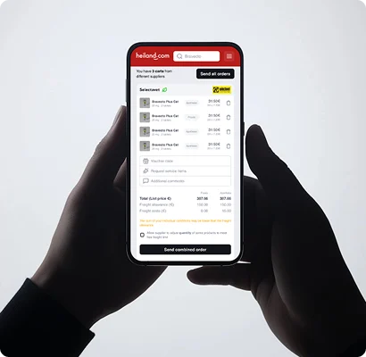
Multiple carts: One cart per supplier, each with its own minimum order value and delivery fee. Overwhelming.
Strategy
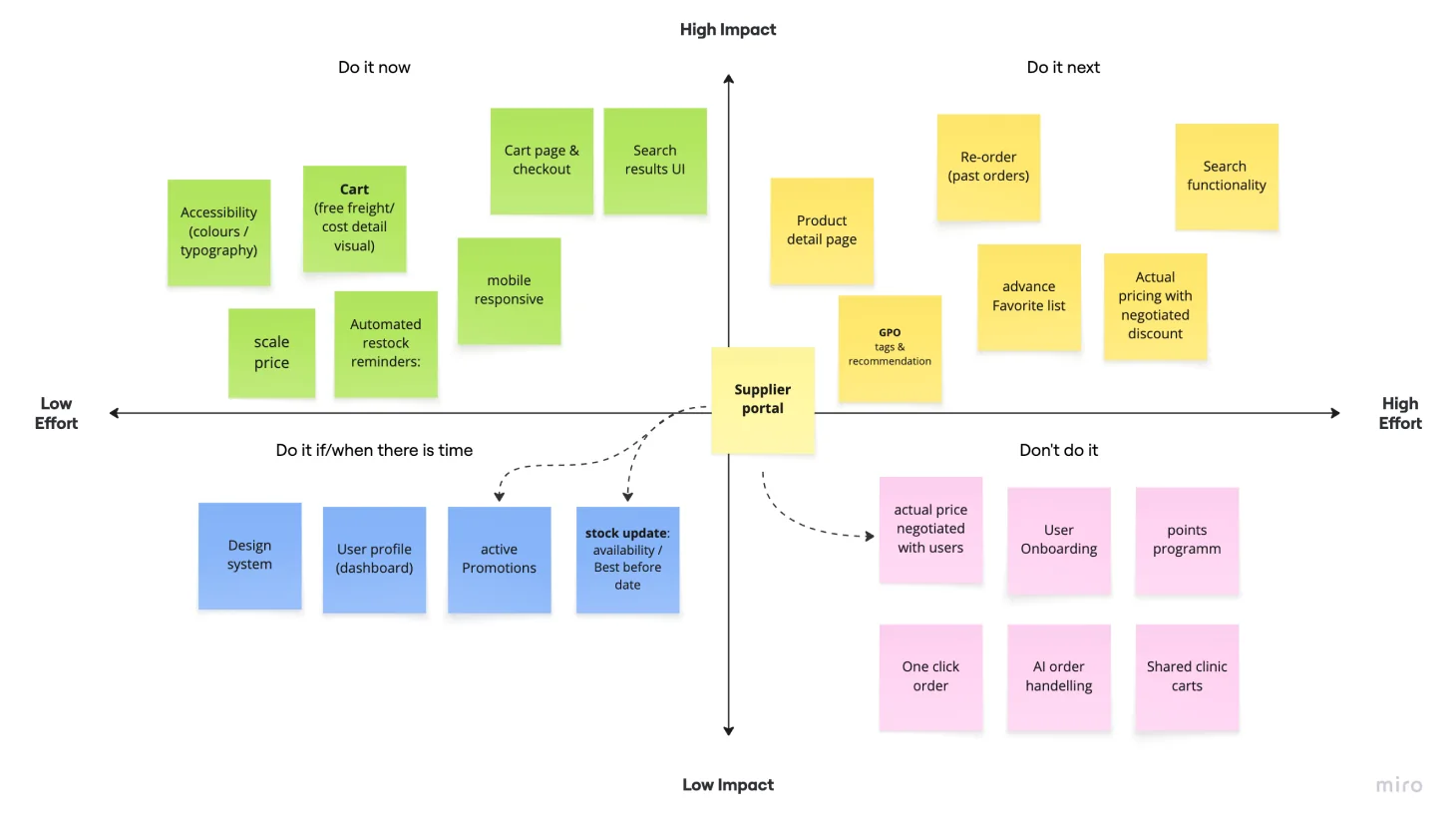
I ranked problems by effort vs. impact, ran a workshop with developers, and picked two themes: frictionless reordering and smart triggers.
- One-click reorder dashboard: previously and frequently bought items, added to cart in one tap
- Automated restock reminders: email and in-app, based on each clinic's order history
- Shared clinic carts: a vet tech builds the cart, the head vet approves in one click
Design & testing
I redesigned the logged-in home from "Discover new products" to "Personalised dashboard" with past orders, estimated inventory, current cart, etc.
To validate fast, I built a clickable prototype with Lovable from my Figma designs instead of a long design cycle. Testing with real users showed:
Loved: one-click reorder
Confusing: shared cart
- Fix: I simplified the cart into one card per supplier, with the logo sticky on top and a checkout option on each.
Accessibility and design system
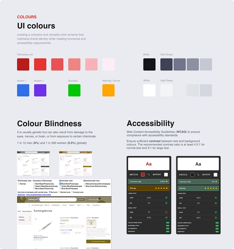
I found critical accessibility issues, like a green CTA on a red background with poor contrast and inconsistent type hierarchy. I introduced an accessible colour palette meeting contrast standards [WCAG AA] and a clear type scale, which became a new design system the team could build on.
Delivery
As PO I turned the designs into user stories, managed the Jira backlog and led sprint planning, keeping scope tight with engineering. We launched as an A/B test to a segment of dormant users, with a "Welcome back" campaign and tooltips introducing the new design.
What I learned
B2B users want speed, not discovery. Vets don't want to shop around, they want to order and get back to their patients.
Two hats make better design. Owning the backlog meant I knew exactly what engineering could ship, so I designed ambitious things that were actually feasible.
What's next
Vets also need live supplier data: product details, negotiated prices, delivery status and stock levels. I started designing a supplier portal where suppliers update catalogues and see how their products and campaigns perform, aiming to make heiland a better alternative to running their own online shop.